FOODIES
CASE STUDY: UX DESIGN certificate
BY GOOGLE

project
App design
my role
UX Designer and Researcher
date
2022
project overview
duration
Two months
product
A mobile application
challenge
Design a mobile application that makes the process of making a reservation on a restaurant easier and a memorable experience for everyone.
the goal
My reservations app will let users check availability beforehand which will affect everyone interested in booking a restaurant bu helping them make a decision on a resevation pressure free.
solution
Foodies is a mobile application that allows users make an easy reservation to any accesible restaurant, being able to check availability, their menus and allergens in the menu before making a decision.
my tasks
User Research, Wireframing, Prototyping.
research
understanding the user
I started with a preliminary interview by asking friends and family what they liked and disliked about going to restaurants, and the process of making a reservation and how they felt about it. With these interviews I gained these insights on pain points during the booking process.
WAITING
Having to wait on the phone until someone answers if they answer. Then wait until they check availability.
AMBIENT SOUND
Being unable to listen to the person speaking due to background noises such as cutlery.
UNPOLITEness
Being treated like non-important, by hearing them in simultaneous conversations. Not feeling listened.
RUSHING
When calling feeling nervous and rushed over to make a fast decision on a date or time.
personas
I created some personas profiles with the information gathered in the interviews to help me understand better the users I could have. Here are two examples.


USER JOURNEY MAPS
I also mapped their journey in the experience of making a reservation on a restaurant. Here an example


competitive audit
There are some existing apps that already allow users to book at restaurants, so I analyzed some of them and some apps. I also identified some restaurants web pages that already allow users to book from their website. These are some of my direct and indirect competitors I researched.


design principles
Based on my personas and their lowest points in their journeys, taking into account the improvement opportunities and my competitive audit I generated my design principles for this project.
availability
Be able to check the number of tables or seats available before trying to make a reservation.
visual
Make it very visual and easy to navigate. Make it accessible for everyone.
personalized
Let users create a profile and personalize their app by letting them add their favorites.
details
Send details of their reservation through SMS or email and let them check on the app for the details any time.
ideation
lo- fi prototype
This lo- fi prototype came from my first digital wireframe for this project here's access to the low-fi prototype.
After this I conducted a usability study.
USABILITY STUDY 1
I made remote usability studies with users from 15- 58-year-old males and females. This was the first time i conducted a usability study remotely and it was an amazing experience for me. I thought it would be really hard to get the emotions from the users, but it was surprise easy to get the feeling by the tone in their voice. After this I realized three really important things:
1. I needed a confirmation page before the reservation confirmation.
2. My home page had to be re designed, as it only showed one restaurant with two options, to see the menu or book. No other restaurant options were available.
3. Most of my users needed more explanation on what was going on, more visual aid and real text, and that I needed a confirmation page before the reservation confirmation.

REFINING THE DESIGN
after usability study
HOME PAGE
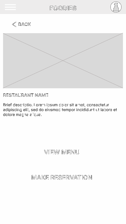
before

Before my first usability study I had a home page with one restaurant option and two buttons for viewing the menu and making a reservation. I needed a way to provide users a better experience with more restaurant options and a nice home page to guide them through their decision.
I divided the home page in two sections, one with a button to select the date and time for reservations and the other one with te restaurant near the user, for them to scan and explore the possibilities they have.
after

CONFIRMATION PAGE
before

after

Before my first usability study I had no confirmation screen and I realized how important it was to avoid users frustrations and how I could do it in the right way.
THE NEW DESIGN

USABILITY STUDY 2.
I built a new prototype and conducted a second usability study. I was really happy with how easy to use my users found to go through the app, navigate and do the tasks I asked. After this second usability study I realized I had to change:
1. The date and time selection screen and system.
2. Text sizing on some screens.
foodies app
After making the changes required, I finished my app. Here's the final result.
next steps
I would love to make this idea happen. And I'd love to find the engineering team who could make this come true, hit me up if you're interested.
I'd like to thank google and everyone involved in the creation of this wonderful course for the opportunity to keep learning in such an interesting way and pushing us students forward.